- Joined
- Apr 14, 2013
- Messages
- 9,709
- Reactions
- 5,045
- Points
- 113
In this thread I'm going to share a series of charts that depicts generational changes, both historically and in recent years. With the year-end rankings set, I updated several charts.
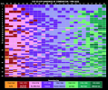
To begin, here's one that depicts the shifting of generations via rankings over the last 25 years or so. I'll elaborate on this in later posts.

This chart spans the entire career of Roger Federer, from his first ATP appearance in 1998 to retiring in 2022 (though not playing). The chart is mostly self-explanatory, but notice the color-coding of the year line near the top: those are the year spans in which the middle year of a generation was 21-25; that is, when they should be dominating the tour, or at least starting to.
It is also interesting to note the "straggler effect" - when a player or two of a given generation hangs on past the rest of his cohort. For instance, in 2009-13 you see the last two of the "Wild West" generation, Tommy Haas and Radek Stepanek, hanging on, both born the last year of that gen (1978). And of course Roger, the lone member of his generation still ranked in the top 50 in 2021-22. Or you can see Andre Agassi remaining in the top 10 as late as 2005, four years past Sampras. And so forth.
But of particular recent relevance, take a look at Lost Gen: a slow rise, and not until the years that they should already be peaking - and then a later and lower peak in the 2014-20 range, with a steep decline, especially in 2022. Consider that 2022 is to Lost Gen what 2017 was to the Novak-Nadal gen. Furthermore, Lost Gen was the first and only generation since Arthur Ashe's (born 1939-43) to not have a year-end #1 or #2.
Lots of other things to note. More charts to come.
To begin, here's one that depicts the shifting of generations via rankings over the last 25 years or so. I'll elaborate on this in later posts.
This chart spans the entire career of Roger Federer, from his first ATP appearance in 1998 to retiring in 2022 (though not playing). The chart is mostly self-explanatory, but notice the color-coding of the year line near the top: those are the year spans in which the middle year of a generation was 21-25; that is, when they should be dominating the tour, or at least starting to.
It is also interesting to note the "straggler effect" - when a player or two of a given generation hangs on past the rest of his cohort. For instance, in 2009-13 you see the last two of the "Wild West" generation, Tommy Haas and Radek Stepanek, hanging on, both born the last year of that gen (1978). And of course Roger, the lone member of his generation still ranked in the top 50 in 2021-22. Or you can see Andre Agassi remaining in the top 10 as late as 2005, four years past Sampras. And so forth.
But of particular recent relevance, take a look at Lost Gen: a slow rise, and not until the years that they should already be peaking - and then a later and lower peak in the 2014-20 range, with a steep decline, especially in 2022. Consider that 2022 is to Lost Gen what 2017 was to the Novak-Nadal gen. Furthermore, Lost Gen was the first and only generation since Arthur Ashe's (born 1939-43) to not have a year-end #1 or #2.
Lots of other things to note. More charts to come.