Big Four Dominance (Visual Depiction)

El Dude

Grand Slam Champion
Joined
Apr 14, 2013
Messages
9,706
Reactions
5,041
Points
113
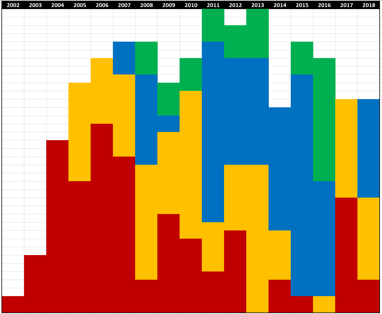
There was some talk in the Rankings thread about Big Four dominance, so I thought I'd create a visual representation of it over the years to give a basis for discussion. The following chart includes all Grand Slams, ATP Tour Finals, and Masters, with each square representing 500 ATP points. This does not include Olympics, ATP 500 or 250 titles.

The colors are: Roger Federer, Rafael Nadal, Novak Djokovic, Andy Murray, with white (or blank) being everyone else.
upload_2019-3-14_6-18-57.png


As you can see, the Big Four--as a group--peaked in 2011-13. 2012 is the most balanced year of Big Four Hegemony; it is the only year each won a Slam and had at least 2000 points worth of big titles. 2011 and 13 are the only years that they won all 14 big titles. Since 2013 they have declined...a bit. Obviously they still are very dominant overall, and it could be argued that the dip in 2017-18 is at least partially due to Andy Murray's injury issues - but that is part of decline.

It is worth noting the downward trend, both from 2013 to the present, but also steadily from 2015 to 2018. That big dip in 2014 was due to Wawrinka and Cilic winning Slams.

Now as far as recent "decline" goes, notice how in each year starting in 2013, one of the Big Four was essentially absent from dominance: Roger in 2013 and 2016, Andy in 2014 and 2017-18, Rafa in 2015, and Novak in 2017.

Takeways: Even if the Big Four are more dominant in 2019 than they were in 2018, the trajectory is clear: their dominance is gradually being eroded, if only from below with Masters titles.
 

Attachments

  • upload_2019-3-14_6-5-52.png
    upload_2019-3-14_6-5-52.png
    33.6 KB · Views: 125

herios

Grand Slam Champion
Joined
Apr 18, 2013
Messages
8,984
Reactions
1,659
Points
113
I I think you should amend the notion "Big 4" for the 2027-18 seasons were just 3. And most likely the absent member, Andy, will never contribute again.
 

El Dude

Grand Slam Champion
Joined
Apr 14, 2013
Messages
9,706
Reactions
5,041
Points
113
I I think you should amend the notion "Big 4" for the 2027-18 seasons were just 3. And most likely the absent member, Andy, will never contribute again.

True, although that has been the case for awhile. I don't think all four have been performing well and/or healthy at the same time since 2012, except maybe in short spells, like early 2014. But looking at the chart, it is clear that they're still--as a group--the dominant group in tennis.
 

GameSetAndMath

The GOAT
Joined
Jul 9, 2013
Messages
21,141
Reactions
3,398
Points
113
I think, the way your represent the colors in each year will be better if you make the person with the most points the bottom most color and then the person with the second best points right above him etc. Just a suggestion.
 

mrzz

Hater
Joined
Apr 14, 2013
Messages
6,121
Reactions
2,901
Points
113
I think Nadal's color should be that awful pink he sometimes wear. And Federer's that atrocious golden of that shameful Wimbledon attire from I don't know when.
 

Moxie

Multiple Major Winner
Joined
Apr 14, 2013
Messages
42,526
Reactions
13,730
Points
113
Sorry, Dude. You make a chart, and all people do is complain about the colors. I support your making about Big 4, because, let's face it, there was one, and their progress was interesting, even though everyone likes to exclude Murray. I think Murray should have been blue, though. :lulz2:
 
  • Like
Reactions: El Dude

El Dude

Grand Slam Champion
Joined
Apr 14, 2013
Messages
9,706
Reactions
5,041
Points
113
I think, the way your represent the colors in each year will be better if you make the person with the most points the bottom most color and then the person with the second best points right above him etc. Just a suggestion.

I played with that, but the problem is that you don't really get to see the player as a whole. It looks more chaotic. But I could probably do another chart that way.

I also added them chronologically. Roger is first each year because he's been around longest; then Rafa. I put Novak next because he won big titles before Andy, even though he's a week younger (and Andy actually won a title first).
 

El Dude

Grand Slam Champion
Joined
Apr 14, 2013
Messages
9,706
Reactions
5,041
Points
113
As for the colors, I figure Roger should be red due to the Swiss flag. Rafa's color is an approximation of clay and golden like Spain. Not as red as clay, obviously, but I wanted to differentiate it from Roger. Novak is blue because that seems like the next logical color; similarly with green for Andy.
 
  • Like
Reactions: Fiero425

Moxie

Multiple Major Winner
Joined
Apr 14, 2013
Messages
42,526
Reactions
13,730
Points
113
As for the colors, I figure Roger should be red due to the Swiss flag. Rafa's color is an approximation of clay and golden like Spain. Not as red as clay, obviously, but I wanted to differentiate it from Roger. Novak is blue because that seems like the next logical color; similarly with green for Andy.
Yes, Red for Roger, Yellow for Rafa, both due to flags, but Blue for Scotland. You missed that one as obvious for Murray. Just giving you a hard time. It's an interesting graph and I appreciate your taking the time with it. But I don't understand how you've organize the tournaments. They seem all over the place. I'm not clear on the x and y on your graph.
 

GameSetAndMath

The GOAT
Joined
Jul 9, 2013
Messages
21,141
Reactions
3,398
Points
113
Yes, Red for Roger, Yellow for Rafa, both due to flags, but Blue for Scotland. You missed that one as obvious for Murray. Just giving you a hard time. It's an interesting graph and I appreciate your taking the time with it. But I don't understand how you've organize the tournaments. They seem all over the place. I'm not clear on the x and y on your graph.

His x is the year. You were probably thinking that y should be in the order in which different tourneys are played during the year. But, he choose not to do it that way, so that he can lump all the points of each player in each year.
 

Moxie

Multiple Major Winner
Joined
Apr 14, 2013
Messages
42,526
Reactions
13,730
Points
113
His x is the year. You were probably thinking that y should be in the order in which different tourneys are played during the year. But, he choose not to do it that way, so that he can lump all the points of each player in each year.
Helpful, thanks. I don't know why that couldn't have been explained, or why I have to search for the y. :lulz2:
 

El Dude

Grand Slam Champion
Joined
Apr 14, 2013
Messages
9,706
Reactions
5,041
Points
113
@Moxie, not sure if you're just razzing me but the year is clearly listed as the x-axis on both charts.

The y-axis is the total number of big title points, with each square being 500 points, which is the highest common factor of big title points (1000, 1500, 2000). For example, as you can see, in 2011 and 2013 the Big Four accounted for all big title points; in every other year they had a varying percentage of the total.

You can't see the squares on the second chart, but known that the smallest squares are Masters, then ATP Finals, then Slams; for non-Big Four, I lumped their titles together (e.g. Wawrinka in 2014 has the equivalent of six boxes, due to winning a Slam and a Masters).

The only important thing to know is that everything is proportional to ATP points of the big titles, and only big titles are included.

As for the ordering in the second chart, I arranged them by player, but within each player I did highest point total first, then in rough chronological order. But that's not really important unless you want the details.

I have done other charts that portray the same information in different ways. I just wanted to create a chart that illustrated the relative and changing dominance of the Big Four, from the time one of them (Federer) won his first big title to the present. It might be interesting to do further charts of different eras of greats. Or simply just decades.